This tutorial assumes you've worked through the first two, screencap manipulation and single model manip.
As with the previous two tutorials, the first thing you need to do is find a picture that can be used for the manipulation.
My favourite maniputation is the one opposite. The original body was so similair to James' and the clothes just right for him too.
The picture needs to already be high quality because you are going to make it look like a poster, promo or article about the show.
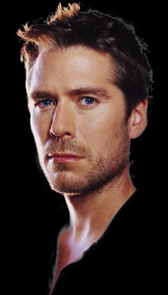
I've decided to manipulate this one. I've been wanting to do it for a while, but have resisted because, to be honest, I'm very happy to look at Gale Harold all day, but for the purposes of this tutorial, it'll be ideal.
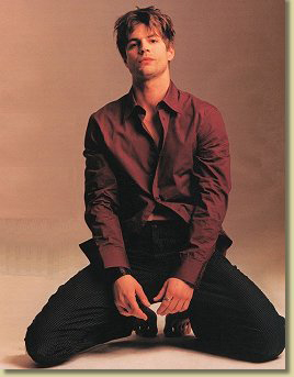
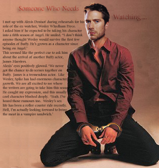
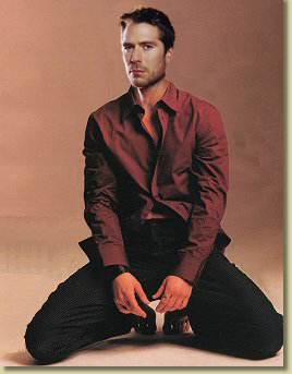
Just for a change, I've decided to put Wes into this poster. I've some lovely promo pictures of him that I've not used. So, as usual, select the right head... ideally, you need one taken from the front, but I like this one so much, I'm going to see if it'll work. The richness of the colour is a very good match for the Gale Harold picture above.
Use mask and copy, or extract and place the head into the base photo.
I'm really getting into the PS 7 extract feature. It's done that (preserving that gorgeous stubble) in about a minute. Amazing.
Do all the things outlined in the other two tutorials to end up with a head and body together. The light is coming in from the left onto Wes' face, so I'm going to add some highlight down his shirt with the dogde tool.
When you've done this, you need to think about text.
I want to make this an article with a mock interview with Alexis Denisof.
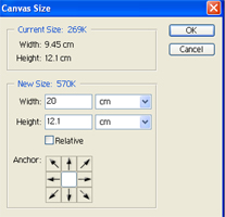
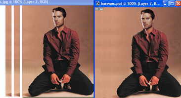
The first thing I'm going to have to do is increase the amount of canvas to work on for the text to make it readable. It's not just an even colour, so sample colour and fill wouldn't work very well.
Click image, canvas size and change the amount to 20. This just leaves you with white space to fill with your colour.
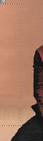
Then select a strip of the pick background with the rectangular marque tool and copy it and paste it several times on the left hand edge. I've shown this with gaps between the new strips just to show you.
Then blend them in with some soft edges and cloning where necessary to make them match. Notice in these I have odd shadows from Wes' knee where I don't want them. I've cloned them out.
The last picture shows you Wes with new space for text.
Click on text and write your 'article'.
I don't use text a lot in my pictures so I have to re-discover the tool every time I use it. (okay, that's my way of saying I don't have a clue!). PS 7 is very different to 5 and there are a lot more text features. With 5 (as with the James picture above) I did each line separately, then lined them up.
With 7 you have the option to set the text in single lines or paragraphs and the text goes straight onto the pictures rather than into a separate text box. It takes a little getting the hang of, but you can then make the text flow around the body. In this picture you need a vast text size. I used 550 pts for the body and over 1000 for the title.
When you are happy with the text, bring the opacity down a little to make it blend with the backgroud. I put a drop shadow on the title and embossed it. I had a red title to match Wesley's shirt, but then colour dodged it anyway. You can play with the layer options and watch the way they change the effect.
When you are completely happy, save the psd picture, then flatten and save.
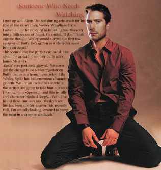
Being critical again, I'm happy with this, but now that empty space to the right of Wes' head seems to need something.
I split the text and added some ellipses to imply that sense of something on-going and I think this is a lot more balanced.
Now we just have to hope that the article comes true!
Do email me if you've found this tutorial useful or if you have some better techniques.
Check out my photoshop links page for more tutorials freely available on the web.

I can't resist this afterthought. Did anyone else think there was just something missing from that picture, or have I been writing vampire slash for too long?
Enjoy.