What should you look for in the original screen caps? You need to have in your mind what you want to achieve with the picture. Is it going to be a very slashy one - in which case you need flesh and emotion. Do you want to tell a story? If so, find caps that already do that. It's easier to have a cap that already has more than one figure interacting; the unwanted person can be removed and the new person added.
You may not be manipulating S/A, but if you are, think about the relative height and eyeline of the original picture. Pictures of Angel with Buffy are often difficult to turn into A/S because Sarah is so much smaller than James and, inevitably, David's position is wrong.
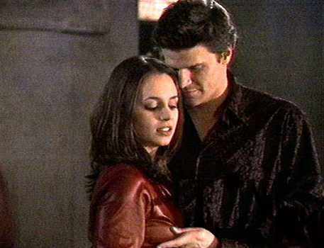
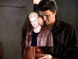
I've chosen the picture on the right because Angel is already interacting with Faith; it's good quality and has strong emotion already. Faith is a good height to replace with Spike.
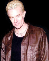
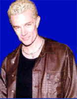
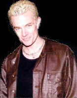
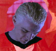
I want to replace Faith with Spike (and why not?), so I need a picture of Spike that will fit. He needs to be standing. It doesn't matter if he's looking left or right or even to the front or back, because in this picture, any of these will work. I know there are not many good pictures of Spike from the back, and anyway, I want to see his face. The picture needs to go as far down as the elbow and not be cropped too closely to his arms.
Don't worry at this stage what expression he has, you can replace his head with another one later on to change the emotion of the final picture.
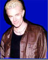
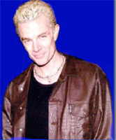
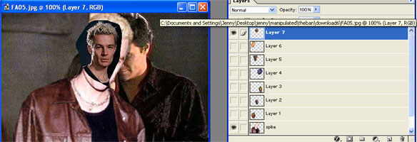
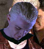
I've picked this picture of James because I like the angle of his shoulders and it fulfils all my other requirements. It's a promo, not a screencap, but as the one of Angel is quite good quality they should go together.
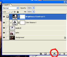
Then click apply mask (red on my screen capture of the tool bar) and the background areas around James will be masked off. You can see that the default option of black in the front and white behind is visible. This means when you paint, the mask will be increased (more blue). If you reverse the default (by clicking where I've shown it pink) the white will be in the front (as in the second smaller capture)- then the blue will be erased.
Where I've shown green, turns the boxes back to their default black and white if you've selected colour options to paint or draw. (by clicking where I've shown a yellow dot and choosing from the colours pallet that pops up)
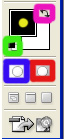

Now for the fun bit. Click on the 'return mask to a selection' button, shown in blue again on the capture. If you look closely at the picture of James, you'll see the selection white dotted line closely around his figure now. If you aren't happy, you can return to the mask and add or subtract areas of the picture. You can keep flicking between mask on and mask off (ie, selected only) until you are happy you've got him all and just him (don't you wish?).
A tip here, just to ensure you don't have stray background, when you are in select mode, click on select, modify, contract and select 1px size. Your selection line will 'jump' one pixel inwards all around the image.
When you are quite happy, click copy and just James will be coppied. Paste him into the Angel/Faith picture.
Now, doesn't that look nice? (not). Be patient.

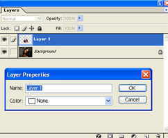
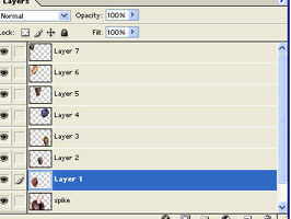
The first thing to do is get a rough scale. You will see that by pasting Spike into the Angel picture you now have two layers... one called background, which contains A/F, and one called layer 1 that contains Spike. Change layer one's name by right clicking on it to bring up the layers' property box. Type Spike into this layer and click ok. (When you have dozens of layers of body parts, it can be very useful to have them named).
When you click on a layer, it is active and blue as shown in the screen shot. Anything you do will only affect that layer.
With the Spike layer selected, click edit, transform, scale. Holding down the shift key, drag a corner of the box that appears around Spike out until he is the right size. Think about head height, and relative size with Angel.
When you are happy, click return.
At this stage, you might want to see if they would fit better together with Spike flipped horizontally (doesn't Angel usually think that?). Click edit, transform and flip horizontal. It doesn't look better, so I'm going to leave Spike facing the same way as Angel.
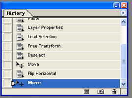
To undo one, or multiple steps, just use the history pallet and click above the step you want to remove. In this case above the flip horizontal.
To move Spike around, click on the move button top right hand corner of the tool bar. You need to position him so it looks like Angel is nuzzling into his hair, or resting his chin on Spike's shoulder. However you think the photo would look most natural.
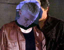
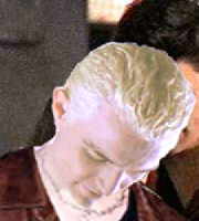
Now, I'm beginning to think that the head has to go. It's obscuring Angel too much and for this photo, the smile is wrong.
This is where the best feature of Photoshop 7 comes in... the file browser feature. I can browse through all my images of Spike/James to find a better head. I want a more suitable emotion... passion, hate, confusion. I need it to lean (doesn't matter which way because I can flip it) and it has to be on a body that is already angled to the camera like the original.
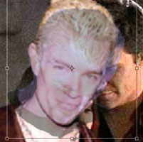
At this stage I lasso any heads I like and copy and paste them into the image. Each one goes into its own layer and you can put in as many as you like. Scale them roughly, flip them as necessary, just to get a feel for the emotion. Here's the rather crazy result if you let them all stay visible!
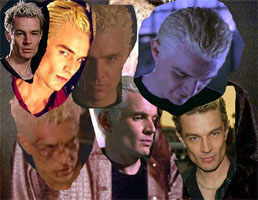
I can discard one already as the battered face is just too extreme for this picutre, and then I turn them all off except for one and scale that slightly more accurately to see the effect.
The first cap shows the layers pallet with them all visible. Click on the eyes on the left hand side to toggle between on and off for each layer.
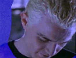
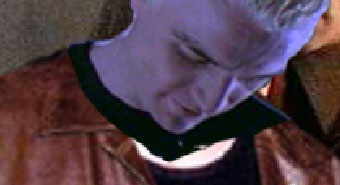
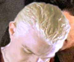
Why this one? Well, the colour is SO off, it will make a useful device to explain recolouring. But I like the way he's hanging his head... it could be confusion, guilt, deceit. The shoulders match the original angle too.
The first thing I need to do is get just the head without that background around it.
When you Ctrl-click on a layer, the image on that layer is automatically selected. So Ctrl-click on the head layer. Apply the mask as you did above, zoom in and paint it closely around Spike's head.
In the first image you can see the edge of the mask - in the second you can see I changed the colour of the mask to red because the background you are trying to paint away is blue and it wasn't clear. To change the colour of the mask, double click on the mask button and you can pick any colour you like.
Notice I've left some of his black shoulders. I want these to do some lining up with the original image. You can remove them in a minute.
Now you have Spike masked off, click back to view this as a selection (see above), then go select - inverse. Instead of having Spike selected, you have everything but Spike selected. Now click delete. Easy, yeah? You are left with just Spike's head.
Click deselect before you do anything else.
Now you have to do some scaling to make the new head match the size of the old. Ctrl-click the head layer.
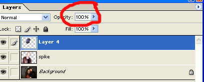
Before you transform, reduce the opacity of this layer by using the slider on the layers palett (shown in red). Take it down to about 40%. Now you can see the original James head behind the new Spike head. Now scale (edit, transform, scale)[remember to hold shift key or you will lose proportions] using the James head for size.
I use the eyes. Scale Spike down until their eyes are matched. In this example you could use tip of ear to chin. Spike is looking down, so it's not the easiest to match, but you can get the ears the same size. When you are happy, press return and then take up the Spike head to 100% opacity.
Now move the head into position. You will see why the black shoulders come in handy now. The one on the right as you look at it is too high. The original James has that shoulder dipped down. To get this new head looking realistic, you need to rotate it slightly clockwise until the shoulders line up. Edit, transform, rotate. Grab a corner of the box that appears and rotate.
Now you have the perfect fit.
Now you have it all aligned, you can get rid of the black T-shirt on the new head. You could use the magic wand for this or just rub it out. Select that layer and work in zoom.
Now you need to make the head layer match the skin tone of the original Spike (don't worry that Angel's is so different at this stage). Click head layer to make it active.
In PS 7 click on the layer adjustment button, as shown in red. Choose colour balance and make a layer above. Click layer from top menus then group with previous. This locks this colour balance layer to just head. Try different options to see what you like, then do exactly the same again, but this time select brightness and contrast. You will end up with two new adjustment layers above head, which you can keep returning to and adjusting. These were the settings I liked best:
Cyan -21, Magenta -42, Yellow -100
Brightness +83 Contrast +17
[In PS 5 click on the layers pallet top right and select layer adjustment and it will give you the option to group with the previous layer or not. In this case, click to say yes.]
Now you need to do some blending of the head to the neck. The most successful way I've found to do this is to use the rubber on very low strength. Double click the rubber. (and I can hear all you Americans snickering, btw). Reduce the opacity to about 20% and choose a soft fuzzy brush. Select the head layer again and carefully just work on the left hand side where the neck sweeps down. Luckily, in these pictures James' necklace will appear from underneath and make the join look pretty seamless.
Next you want to blur around the edge of head slightly to make it sit better with the background. Select the blur tool, a very small brush and high zoom and just run it round the edge. (remember to click back on head layer - if you forgot and blurred on the Spike layer, use the history pallet and just get rid of that).
Another way to do this that is very effective is to Ctrl-click the head layer, click select, modify, contract and choose 1 pixel. Then go select again and inverse. Now you have that tiny 1 pixel border selected. Go filter, blur, blur more. It's very soft and very even.
This second method blurs all around the head, including the chin. You can decide which method makes a better join.
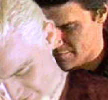
Now James is looking good, you can join the head to the body.
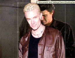
Hide the background layer by clicking on its eye. Then to layer, merge visible - James' body, new head and all adjustments will go into one layer. Now you can move James around as a whole. So move him so Angel is better positioned behind him (and resist any slashy thoughts at that).
Now for a clever bit. Flip Spike horrizontally. Clever hey? Really good fit now.
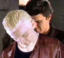
I think this picture would look better with Angel more integrated with Spike, (hell, I think everything is better when Angel is more integrated with Spike).
Stay on the background layer and do a rough selection around his head with the lasso. Copy it. Click on Spike layer and paste. Angel's head now 'floats' over Spike.
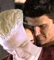
What you are trying to achieve is Angel's chin propped over Spike's shoulder. Obviously, Faith has to go, so rub out until you have just Angel.
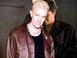
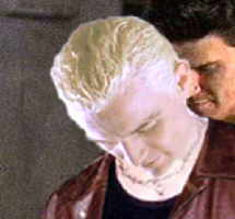
I then rubbed out most of Angel's overlapping face, leaving just his chin over Spike. It's a small change, but worth it as you can see from the before and after.
I've increased the brightness on Angel (background layer and chin layer).
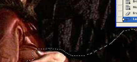
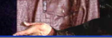
I want to bring Angel's arm back to the front now. Make all the layers but the background invisible. Do a rough selection around the arm with the lasso and then copy it. Go to very top layer and paste it in. Select it, mask it and tidy it up.
You're almost there. If you save now, you save a PSD version of your work... ie, all the layers still intact. I always do this so I can change the picture later. I have a very large hard drive though... these PSD files are very big.
When you have a saved layer version, click layer and flatten image. You can save this as a jpeg or gif.
To finish, I want to blend the two figures more, make the scene more intimate. Click filter, render, lighting effects. I particularly like the 2 o'clock spotlight. Experiment with the ambience settings and the radius of the spotlight. This is a frustrating filter because the preview looks nothing like the finished effect. You just have to do it and if you don't like it, undo it!
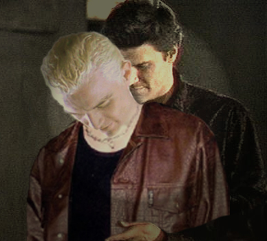
There you have it. 'Final Betrayal'
I always send my pictures to my Beta, Adsum, for her to look over before I post. I get too close to them and can't see flaws (I once left Buffy's leg in between Spike's. Even in my fics he's not THAT well endowed!)
Be critical with your own stuff. In this picture, I would work more on Spike's skin tone between the face and neck, or use different lighting techniques to hide the difference. I might try making Spike a little smaller. I have a very high-resolution monitor now and flaws show up much more than on my old computer. If you keep a PSD version of your picture, these flaws are easy to fix until you are happy.
Good luck.
If you've enjoyed this tutorial, I'd love to hear from you: spikesno1fan@hotmail.com